Why a bilingual brand identity is not a translation
Short answer: No. A bilingual identity is not a translation. Arabic and English are two scripts with different shapes, directions and rhythms. If you only translate, the brand looks and sounds like one language wearing the other as a costume. A good bilingual identity is built so both languages feel native, and both feel like the same brand.
What is a bilingual brand identity?
It is a visual identity designed from the start to work in two scripts, usually Arabic and Latin. It has a logo that works in Arabic, in Latin, and together. It has a type system for both scripts. And it has layout rules that hold up when the page flips from left-to-right to right-to-left.
Why does translation alone fail?
Because the problem is not the words. It is the design around the words.
- Different shapes. Arabic letters connect, change shape inside a word, and carry dots and marks above and below the line. Latin letters stand apart. The same weight and size do not look equal.
- Different direction. Arabic reads right to left. Layouts, arrows, progress bars and icons that point forward need to be mirrored, not just translated.
- Different rhythm. Arabic often needs more vertical room than Latin. Copy the spacing from the English layout and the Arabic feels cramped.
- Different tone. A friendly English line can sound careless in Arabic, and a formal Arabic line can sound stiff in English. The voice needs to be written twice, not converted.
What should a bilingual logo include?
Plan for three versions, and design them together:
- Arabic lockup: for Arabic-first places.
- Latin lockup: for English-first places.
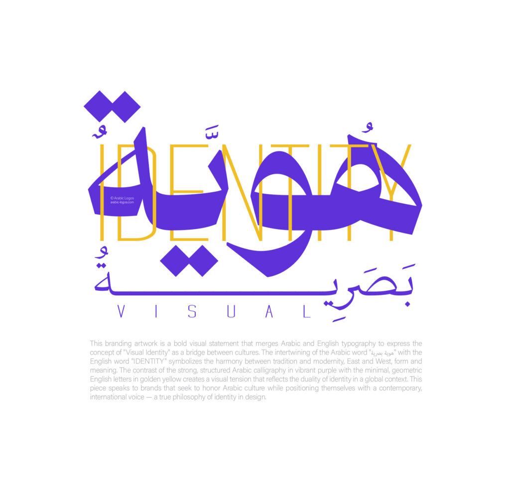
- Bilingual lockup: both scripts side by side, with a clear rule for which sits where, and which is bigger.
The three should feel like one mark. Same weight, same personality, same proportions as far as each script allows.
How do you tell if your identity is only translated?
- Does the Arabic look smaller, lighter or plainer than the English?
- Was the Arabic font chosen after the Latin one was already final?
- When you flip to right-to-left, do arrows, icons and menus still make sense?
- Would a native Arabic reader say the copy sounds written in Arabic, not translated?
- Do both versions of your website feel like the same brand?
Frequently asked questions
Do I need a separate Arabic logo?
You need a logo that works in Arabic. That can be a separate Arabic lockup, a bilingual mark, or a symbol that needs no language. What you should avoid is a Latin logo with Arabic letters dropped in beside it.
Should the Arabic or the English come first?
It depends on who the main audience is. Choose one as the lead for each place, and be consistent. The mistake is leaving it to chance, so each designer makes a different choice.
Can the same person write both languages?
Only if they are truly strong in both. Most of the time it is better to write each version for its own readers, then check that they say the same thing.
Which digits should I use in Arabic text?
Both Western digits (0 to 9) and Eastern Arabic digits are used. The choice depends on your audience and market. Pick one standard for the brand and keep it in every place.
Need an identity that works in both scripts?
We design the logo, the type system and the website as one system, in Arabic and English together. See a mark built in both scripts, or tell us what you’re building.